Today when I opened Google Chrome—just like every other day—I clicked on the Search Console icon that sits on my bookmarks bar. It’s a habit now. I check my site’s performance, impressions, click-through rates—you know, the usual routine if you run websites. But something was off today. Not in a bad way. Just… different. The logo had changed.
That tiny change sparked something in me. I found myself sitting there, sipping coffee, thinking deeply about logos. Especially Google’s logos. You might think, “It’s just a logo, why care so much?” But when you’ve spent 15 years in the tech world using Google’s ecosystem daily, even a slight shift like this feels like noticing your friend got a new haircut. Familiar, yet fresh. And it led me down a rabbit hole of branding, design, and why logos—especially simple ones—matter more than we realize.
If you’re someone new to tech, curious about design, or just beginning to explore the tools that power the web, I want to walk you through this thought process. Not from a textbook angle, but from someone who’s been using these tools for over a decade and sees how every small detail ties into a larger brand story.
My 15-Year Relationship with Google Tools
I started using Google long before Android was even a thing. Back then, Gmail was invite-only, and Google Search was already the go-to for students like me trying to finish assignments at the last minute. I’ve seen the rise and fall of services like Google Reader, the birth of Google Docs, and the growth of Search Console from a basic webmaster tool to the powerful SEO dashboard it is today.
In all these years, one thing remained consistent—Google’s approach to visual identity. Their logos evolved, but never drastically. Always subtle. Always smarter.
A Look at Google’s Logo Philosophy
Google doesn’t just throw colors and shapes together. Their logo changes are carefully planned by their design teams—like the Google Creative Lab and the Material Design team. These are the folks who obsess over every pixel so users like us can have an effortless experience.
The current Google “G” you see everywhere—from Gmail to Maps to Drive—isn’t just a letter. It’s an identity system. It’s a combination of four colors that feels friendly, accessible, and instantly recognizable. It’s confident enough to be just one letter, and still be understood globally. That’s no small feat.
What Makes a Good Logo?
Let me explain this the way I’d explain it to a student or a junior designer I’m mentoring. A good logo isn’t just about looking cool. It’s about being clear, memorable, and consistent. Think of it like a handshake—your first impression. If it’s messy, complicated, or forgettable, people won’t trust it.
Facebook has the letter “f.” Apple has a bitten apple. Twitter had a bird. Google has the “G.” These aren’t just letters or icons. They’re shortcuts to recognition. They’re branding assets that instantly tell you, “You’re in the right place.”
Why Simplicity Wins
Here’s the thing about logos: they don’t live on paper anymore. They live on screens, and not just big ones—on watches, phones, browser tabs, app icons, even smart TVs. A good logo has to be readable at 16×16 pixels. That’s tiny. And that’s why simple logos rule.
Google has only G in logo.
Facebook has only F in logo.
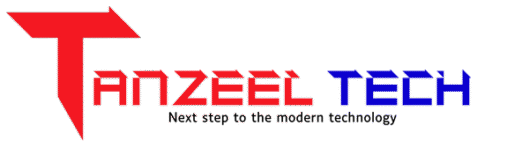
Tanzeel Tech has only T in logo.
When Google updated the Search Console logo, it became more in line with the rest of its suite—cleaner lines, fewer distractions, and more consistency. That helps me, as a user, navigate faster. I don’t have to think twice. That’s the beauty of good design—you barely notice it, because it’s doing its job right.
The Team Behind the Pixels
Google’s design team isn’t just made up of graphic designers. They’re product thinkers, researchers, UX experts, and even psychologists. Every color, every curve, every font weight—they’re all chosen with intention.
They follow their Material Design system—a set of design principles that focuses on clarity, responsiveness, and real-world metaphors. They don’t just want their products to look pretty. They want them to feel human, intuitive, and helpful.
Why This Matters to You
If you’re just stepping into tech, design, or digital marketing, take this as a reminder: small things matter. Icons matter. Logos matter. They’re not just decoration—they’re silent communicators. They build familiarity, trust, and identity.
And when you start using tools like Search Console, Google Ads, or Analytics, you’ll begin to appreciate how much clarity a well-designed interface and icon can bring to your day.
Final Thoughts: Design Isn’t Decoration—It’s Communication
After 15 years in this space, I’ve learned that design isn’t just about aesthetics. It’s about function. Google’s evolution—from colorful wordmarks to the minimal “G” and simplified product logos—is a masterclass in modern branding.
So next time you spot a tiny logo change, don’t brush it off. That small icon might have taken months of thought, testing, and iteration. It’s a visual handshake from the product team to you, the user. And once you understand that, you’ll start to see tech in a whole new light.
Even a logo, when done right, tells a story. And Google? They’ve been telling that story pixel by pixel for years.